Information architecture (IA) is a professional practice and field of studies focused on solving the basic problems of accessing, and using, the vast amounts of information available today.
In simple terms, it answers the questions:
Where am I? What am I looking at? Where else can I go?
Information architecture if done well, allows the user to navigate around a website or application with ease, and gives them the best way to accomplish their goal.
The term “information architecture” was first coined by Richard Saul Wurman in 1975. Wurman was trained as an architect, but became interested in the way information is gathered, organized and presented to convey meaning. Wurman’s initial definition of information architecture was “organizing the patterns in data, making the complex clear”.

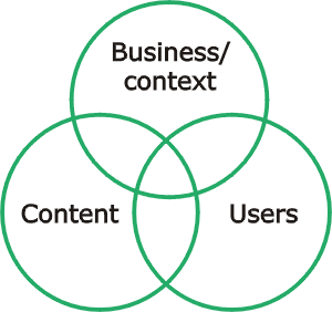
This is commonly how IA is represented.
There are two main approaches to defining an information architecture. These are:
- Top-down information architecture: This involves developing a broad understanding of the business strategies and user needs, before defining the high level structure of site, and finally the detailed relationships between content.
- Bottom-up information architecture: This involves understanding the detailed relationships between content, creating walkthroughs (or storyboards) to show how the system could support specific user requirements and then considering the higher level structure that will be required to support these requirements.
The most common methods of defining and IA are things like site maps, page templates and layouts, to personas and storyboards.
Without a good IA, people will have a difficult time finding what they need to on a page or website, and most likely not come back. Just like with architects of buildings, if they do not design with codes, accessibility, and the user in mind, the final product suffers.
Something to think about: What websites do you frequent that have good IA? Which ones are not so good?
This was originally published on Medium.